A Modern Transformation
 This project has been one of my favorite transformations…EVER! The house was beautiful to start with, but my client was having a hard time expressing her modern taste in a way that made the house feel connected. We started out with their family room – they were open to pretty much anything I suggested, but they wanted the focal point of the room to be the beautiful photograph by Peter Lik. Below is the “old” family room:
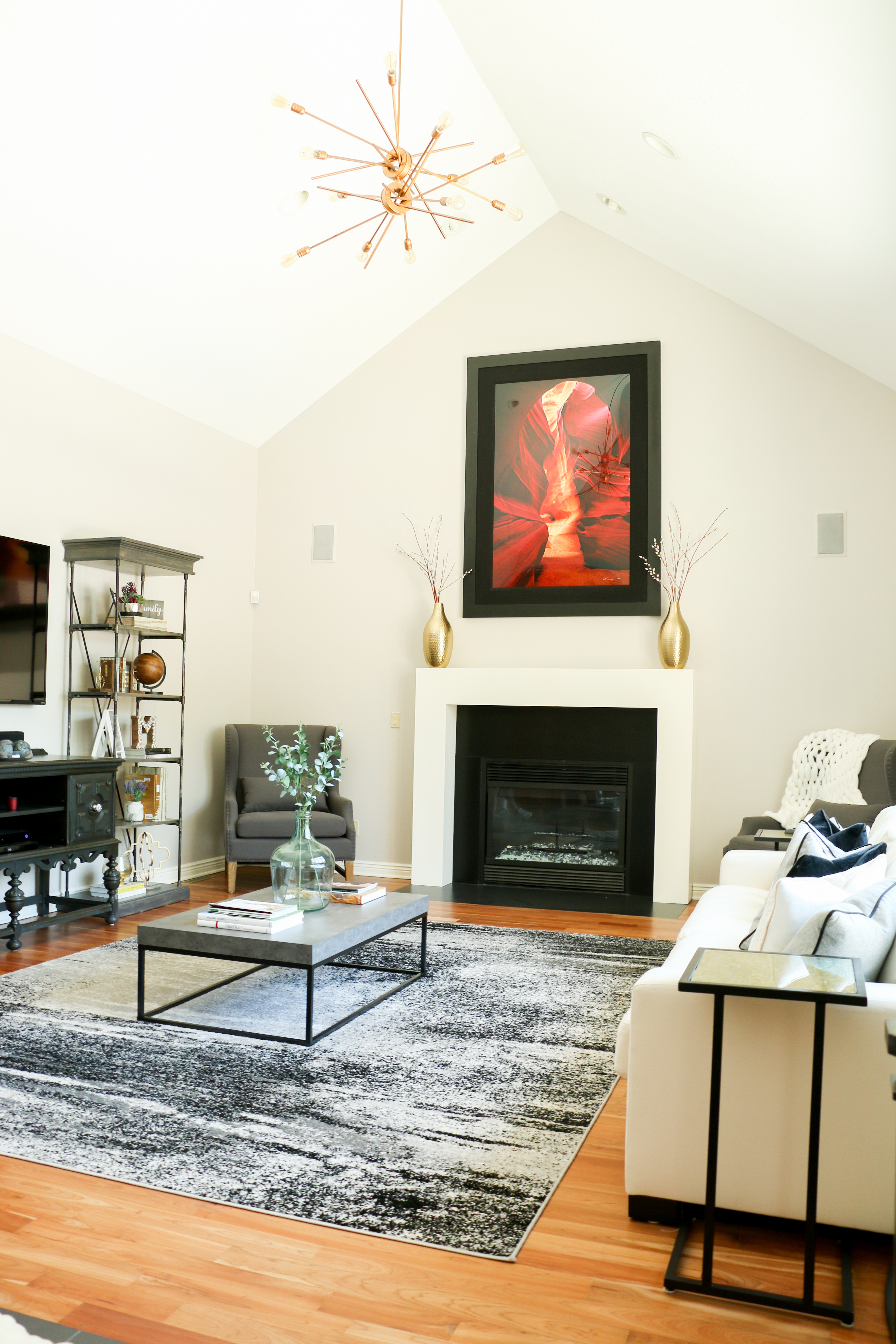
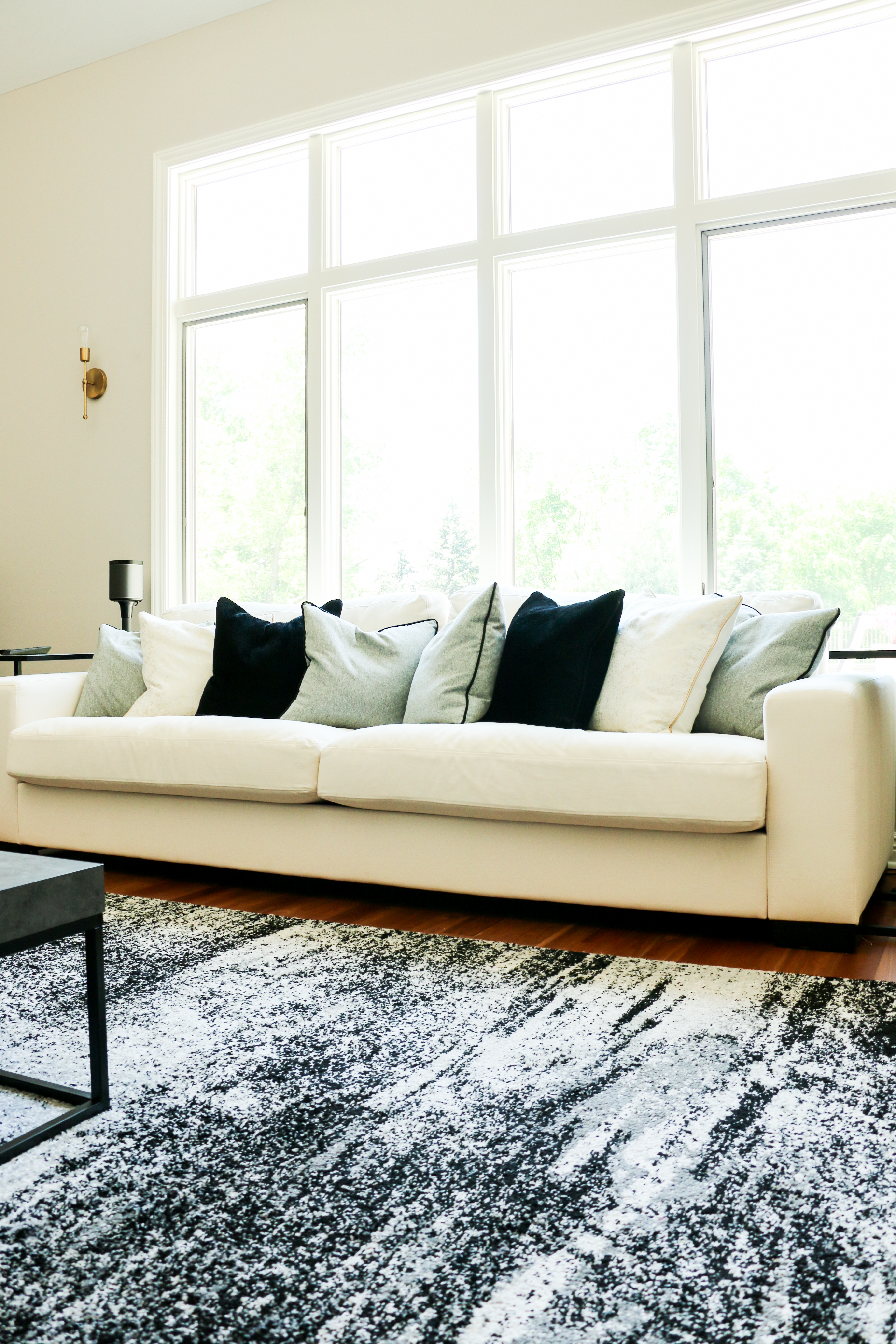
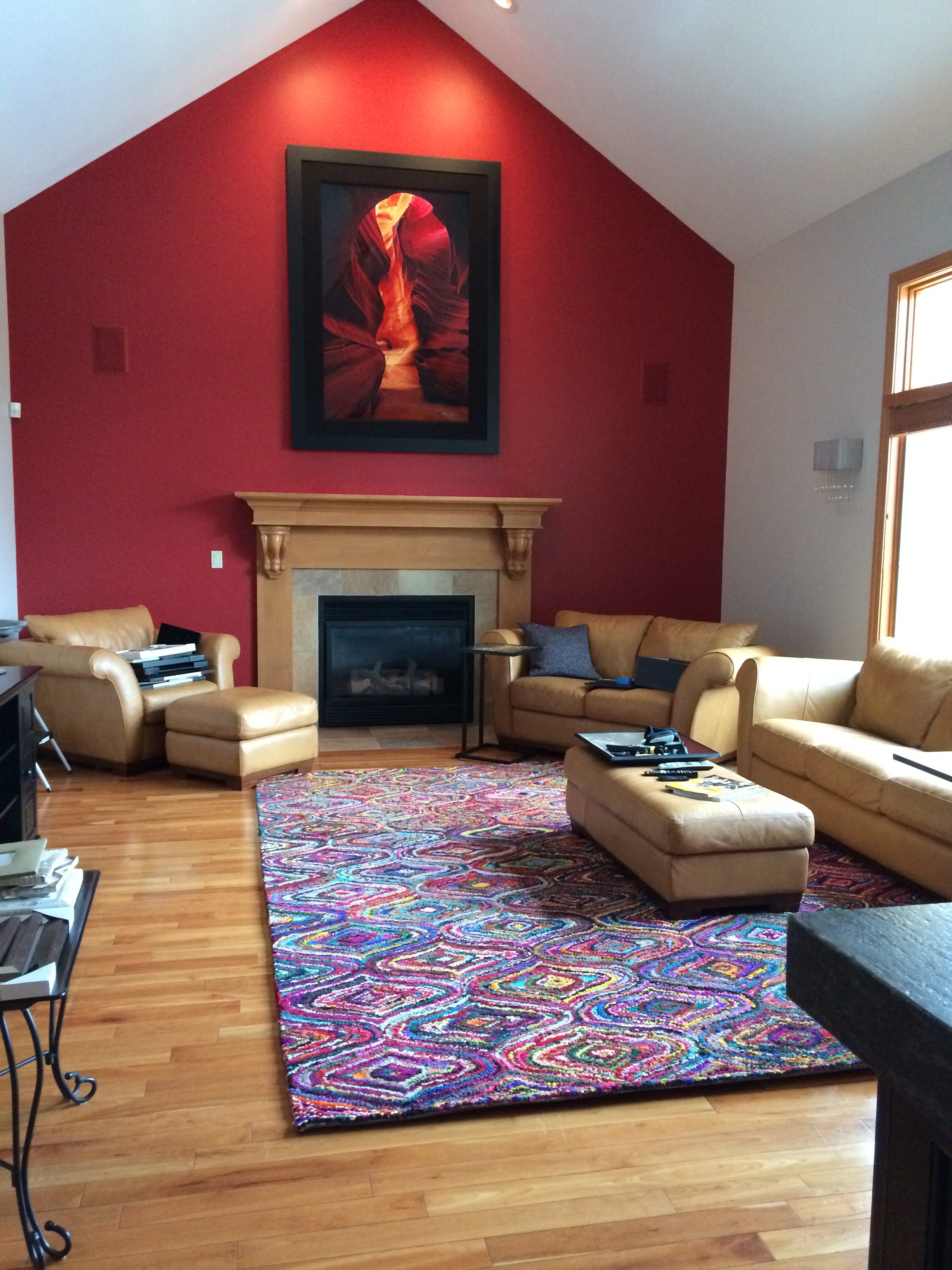 I decided to get rid of the red accent wall, to really make the red in the photograph pop. We also painted all the trim white and the client hired a carpenter to build out a more contemporary fireplace mantel. To satisfy the customer’s modern taste, we selected furniture with clean lines and arranged it symmetrically. I love the gold accents that we added, and the super modern light fixture was the perfect icing on top of the cake:
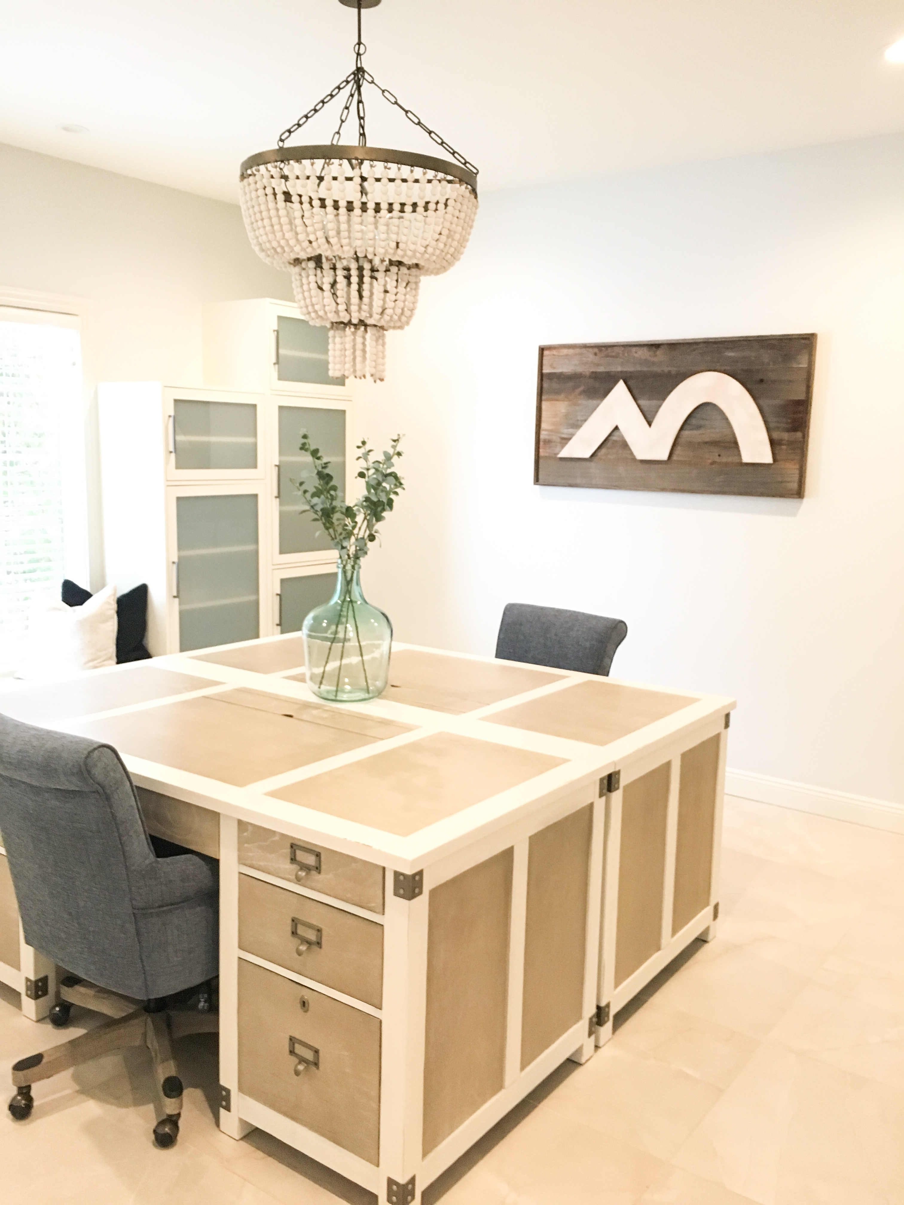
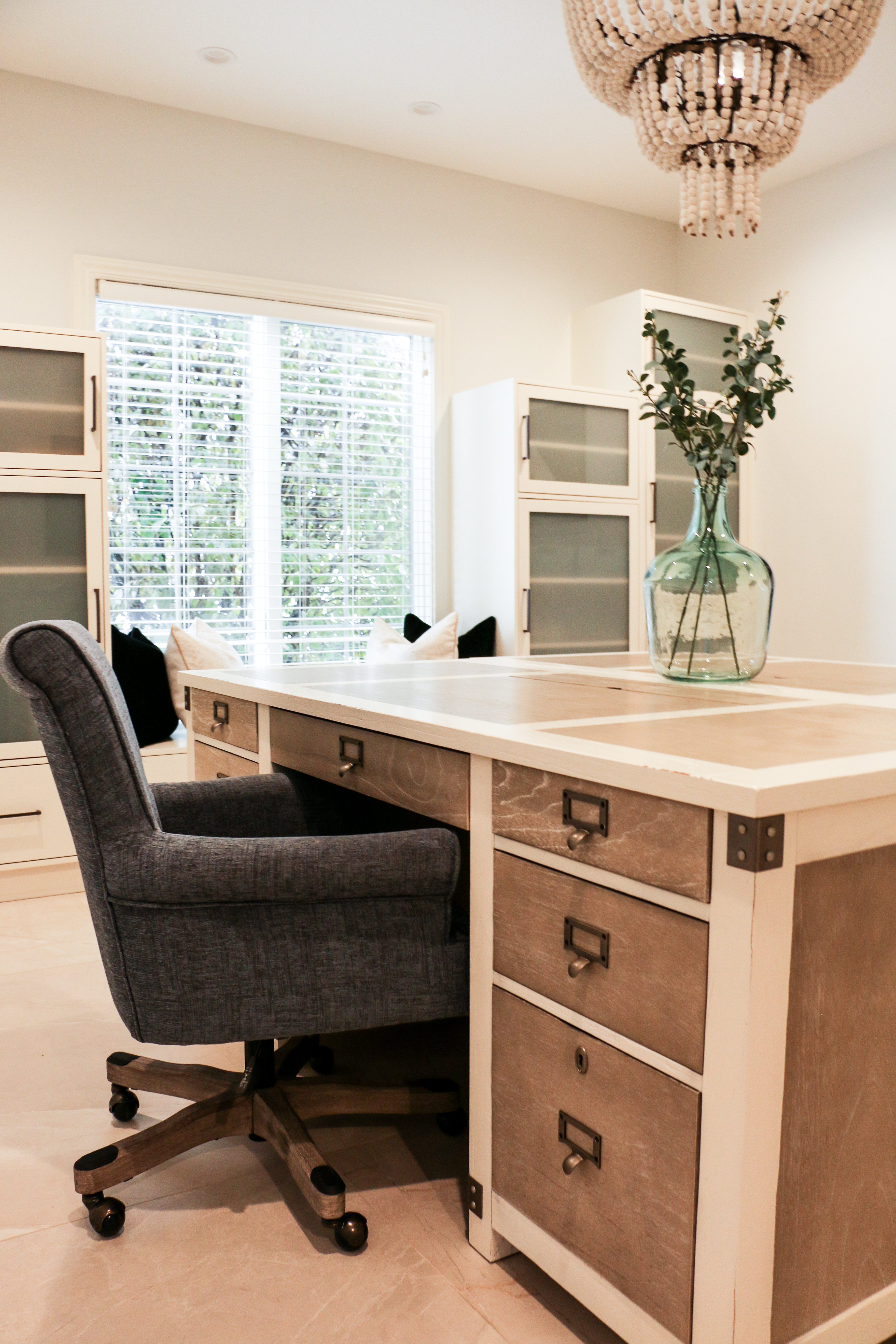
After the living room, we moved on to the client’s office. They work from home often, and the current space was dark, outdated and had a variety of colors…not a reflection of the customer’s personal taste. The bulky furniture made the room feel so much smaller than it actually was. My goal was to brighten, update and make the room feel connected to the rest of the house.
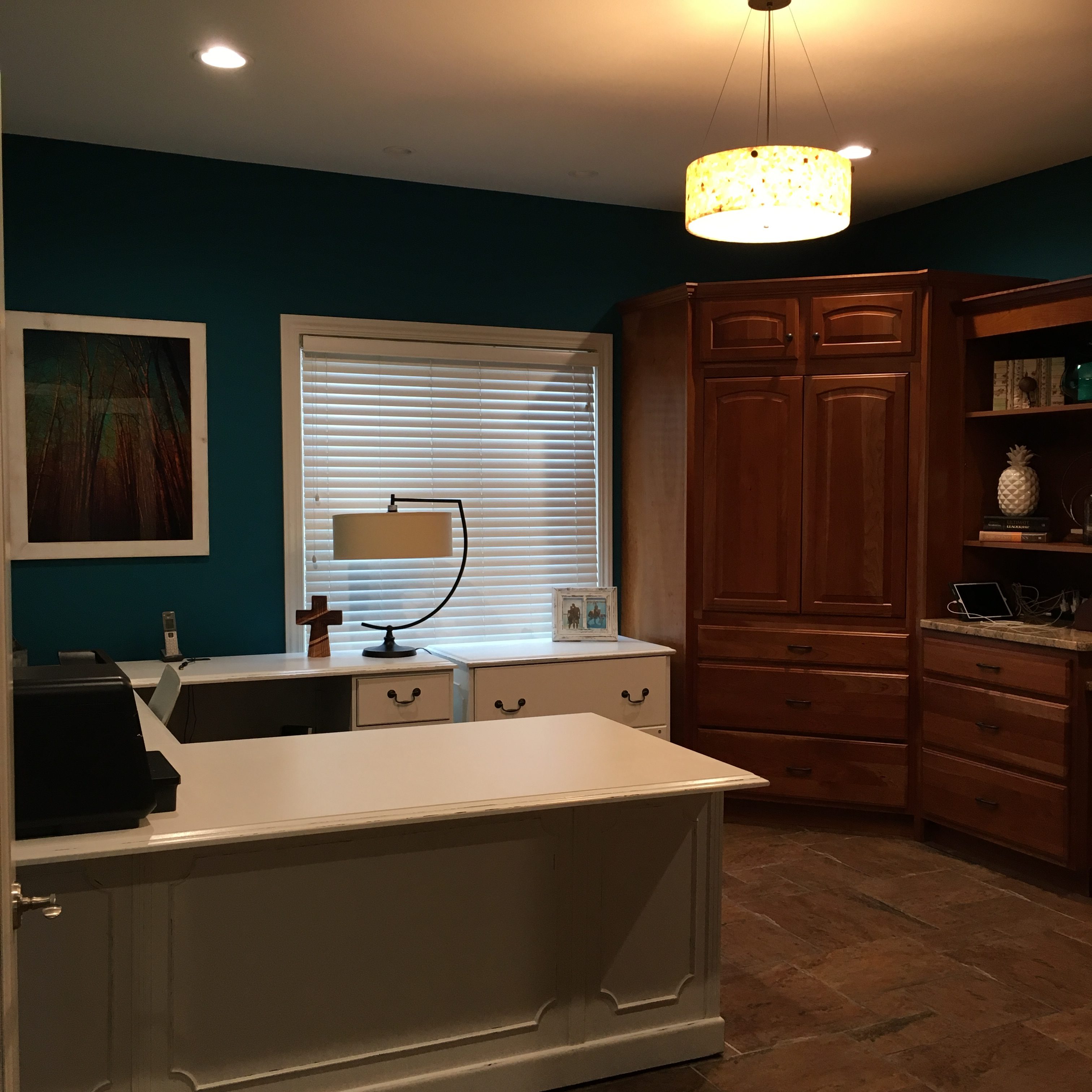
We started by ripping out all the cabinetry and flooring in the room, and we went with a very neutral paint color. We found a fabulous desk from Arhaus and bought two of them. I also found a light fixture when I was in a cute little Southern town called Cookville, TN that was a perfect fit for this space. Perhaps the most impressive part of this room are the custom built-ins – I drew my vision on paper, and the client’s sister (yes, SISTER) built them! They are absolutely perfect, with soft-close doors and everything. We had a custom sign built by an awesome company, Harper Grayce Designs, which displays the client’s logo…the perfect touch for a home office.
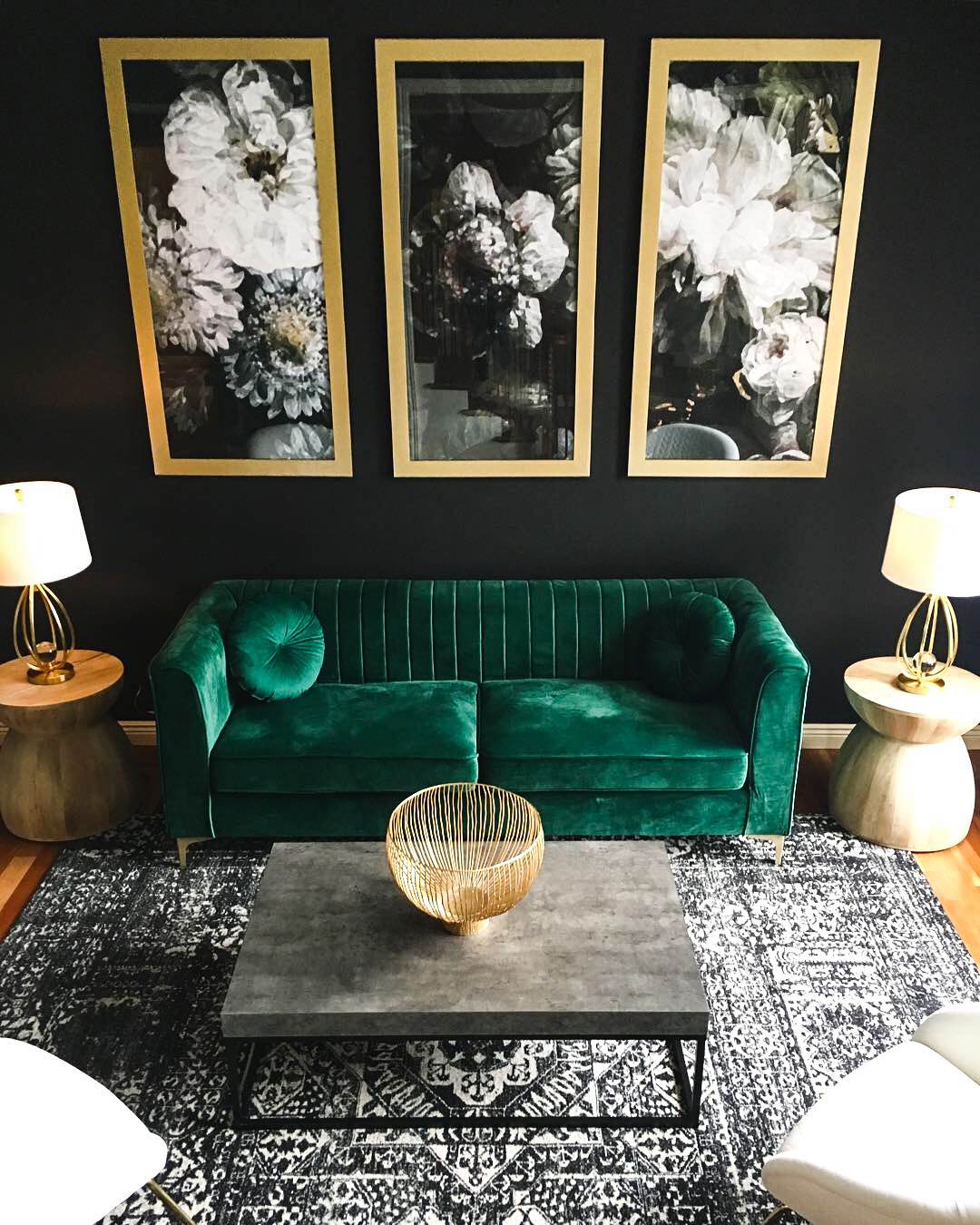
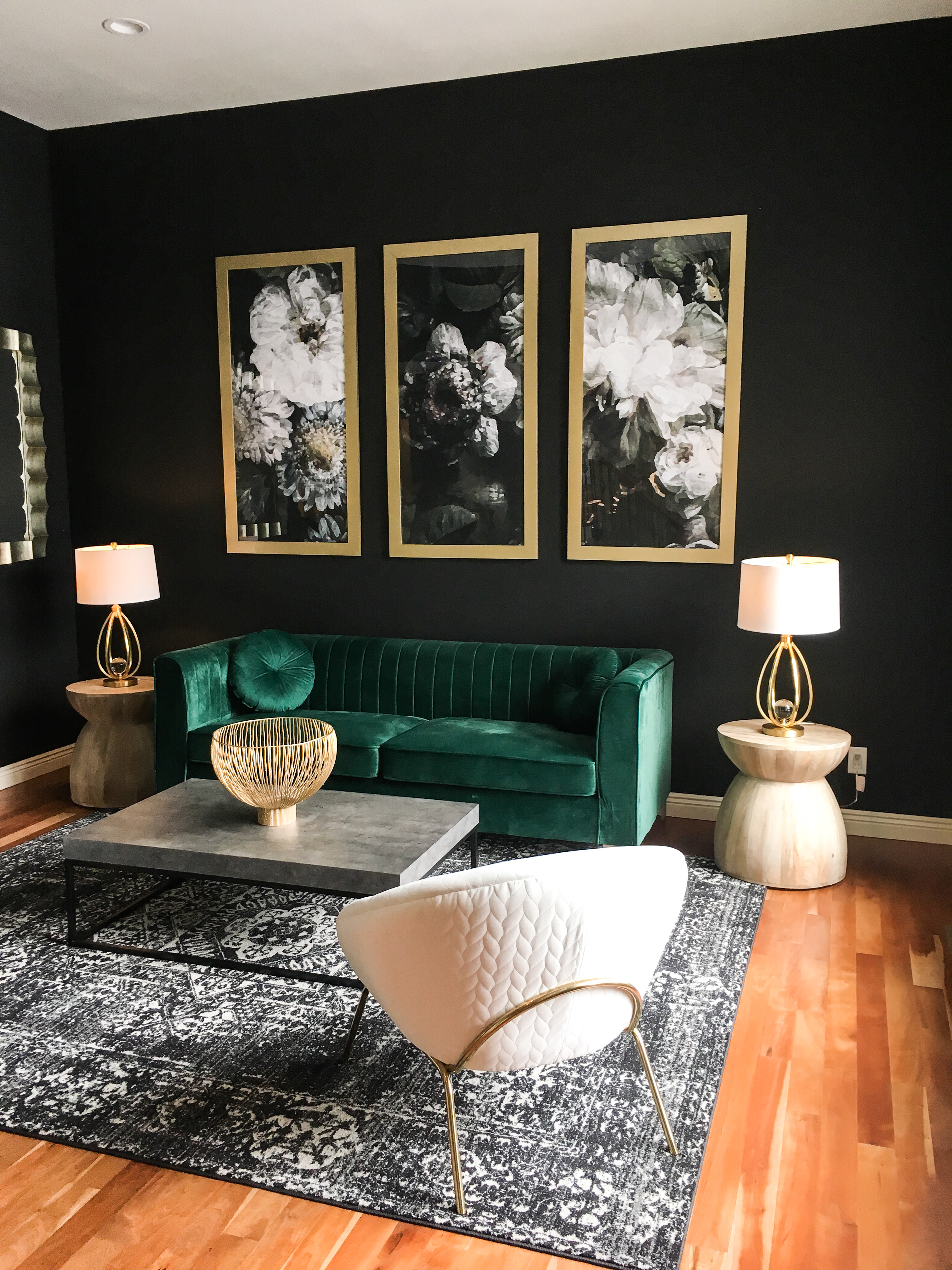
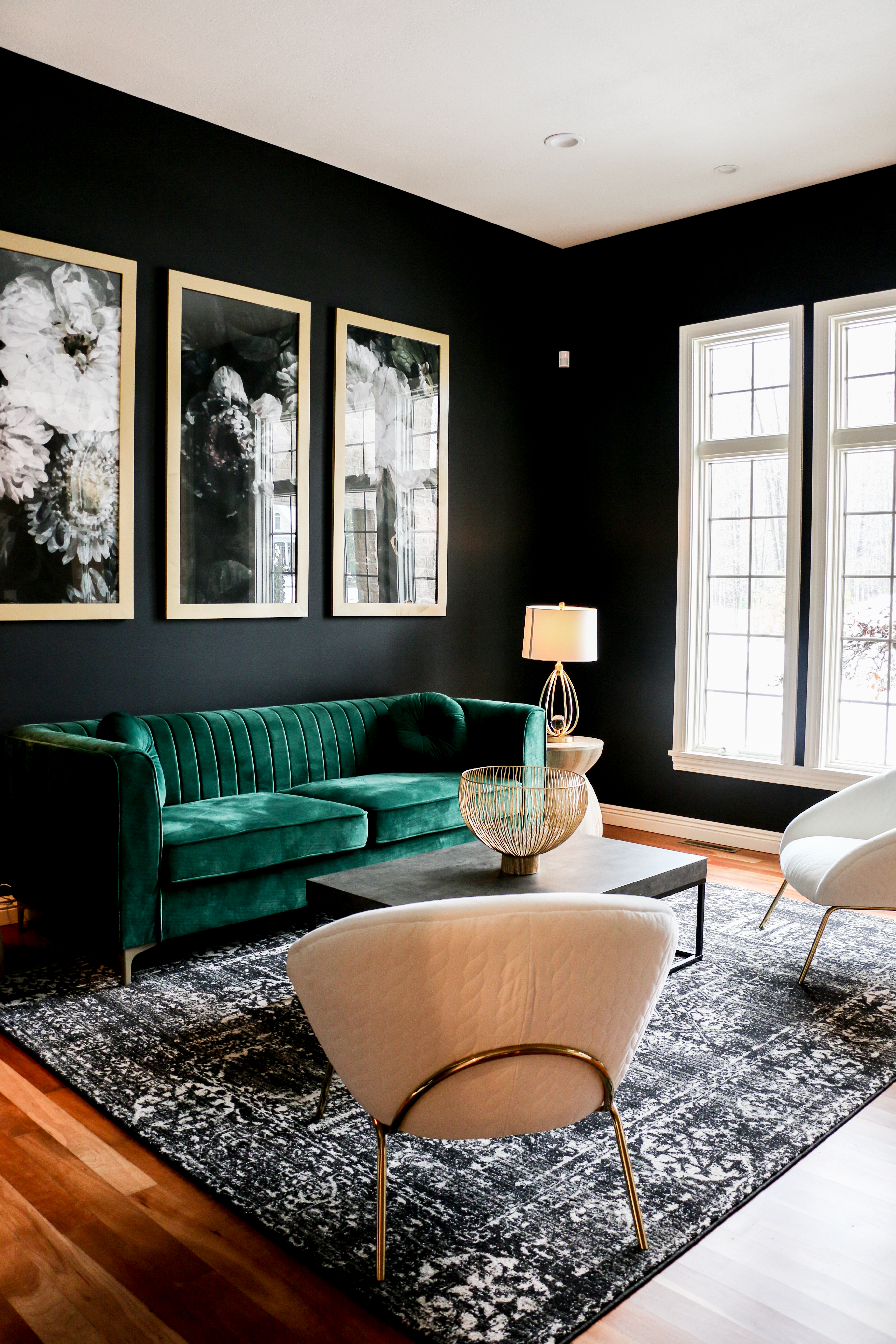
Last but not least, we come to my favorite room in the house…and perhaps the biggest transformation yet. This entry room is the first thing you see when you walk in the front door. It was a mish-mash of color and style, and again wasn’t a reflection of the client’s style.
It took a couple of months, but I convinced the client to go with black walls. This room has extremely high ceilings and natural light, so I wasn’t worried about the black being too overwhelming. I knew it would be the dramatic, modern look that she was looking for. The only request the customer had was that I find a way to incorporate emerald green furniture. Anewall Decor is a company that makes some of the most gorgeous wallpaper I’ve ever seen, and they make a floral paper that was perfect for this room. Instead of using the paper for the wall, I wanted to use it as art. So the customer’s amazing sister built three custom frames to display the wallpaper – this is less permanent than wallpapering the walls, and still provides a dramatic effect.